
Email-Based Analytics Reports Vs Dashboards: Where Insight Wins
If you think your inbox is just a digital postbox for mundane updates and recycled newsletters, think again. Email-based analytics reports have stealthily transformed the war room of modern business, turning every “ping” into a potential goldmine—or information landmine. In an age where dashboards drown us in data and apps demand our constant attention, the humble email report slices through the noise, promising insights delivered straight to your line of sight. But behind every cleanly formatted chart lurk untold truths, hidden pitfalls, and game-changing tactics no one’s eager to spell out. From real ROI numbers and the mobile device revolution, to the very real threat of data breaches and the psychological gymnastics of inbox trust, this is your no-nonsense guide to mastering analytics in your inbox. Let’s rip open the envelope and expose what your inbox isn’t telling you about email-based analytics reports.
Why your inbox is the new data battleground
The evolution of email-based analytics
Not so long ago, analytics meant wrangling endless Excel files, squinting at printed charts under flickering fluorescent lights. Finance teams and analysts would huddle over static spreadsheets, hoping a key insight hadn’t slipped through the cracks. But as business intelligence platforms evolved, a seismic shift occurred: data stopped waiting for us to log in. Instead, it started showing up—on schedule, in our inboxes, perfectly packaged for immediate action.

The shift to email as a data delivery channel was driven by the need for real-time insights without the friction of platform logins or cumbersome dashboards. According to a 2024 GetResponse Benchmarks Report, email open rates for analytics and business reports have jumped sharply, in part because busy professionals don’t have the patience to chase down data across multiple platforms. Automated email reporting, once a novelty, is now a staple for industries from finance to marketing to healthcare. The rise of platforms like teammember.ai underscores this trend—where AI-powered insights are delivered straight into your inbox, making data not just accessible, but impossible to ignore.
How email reporting bypassed dashboard fatigue
Dashboard fatigue is real. In a world oversaturated with apps, notifications, and endless tabs, engagement with traditional dashboards has plummeted. “Push” data channels like email have surged because they bring the information to you, instead of making you hunt for it. Executives and team leads increasingly report that they rarely log in to analytics platforms unless prompted by something compelling in their inbox.
| Engagement Channel | Average Open Rate | Average Click-Through Rate | Notable Trends |
|---|---|---|---|
| Email Reports | 39.6% | 3.2% | Mobile use surging |
| Web Dashboards | 18.2% | 1.1% | Fatigue, declining engagement |
| In-app Notifications | 23.5% | 2.4% | Overload, often dismissed |
| SMS Alerts | 16.9% | 3.9% | High immediacy, low context |
Table 1: Comparison of engagement rates for different analytics delivery channels. Source: Original analysis based on GetResponse 2024, Mailmodo 2024, and Litmus State of Email Reports.
Why do executives prefer actionable insights delivered by email? It’s about context, convenience, and the psychological nudge. Emails land in line with other critical communications, fit seamlessly into mobile workflows, and can be forwarded, flagged, or acted upon without switching apps. And with engagement rates for email analytics far outpacing dashboards, the verdict is clear: when it comes to actionable business intelligence, your inbox is winning.
Inbox overload vs. actionable clarity
But there’s a dark side. The same power that makes email-based analytics reports indispensable can also turn your inbox into a digital minefield. Studies on information overload, such as those cited by the American Psychological Association, reveal that when data comes at us too fast or in too great a volume, our ability to extract value plummets. Decision fatigue, missed insights, and even stress-related errors can result.
"Sometimes the best insights are the ones that come to you, not the ones you chase." — Amir, IT manager
The trick isn’t just about getting analytics into your inbox—it’s about curating what shows up, and how. Targeted, concise reporting that highlights key takeaways (and suppresses noise) is the secret sauce. It’s the difference between an inbox that empowers you and one that buries you alive. Achieving that balance means understanding both the psychological impact of data delivery and the technical mastery of report customization. As we’ll see, not all inboxes are created equal.
The anatomy of an effective email analytics report
Breaking down core components
What sets an effective email analytics report apart from a forgettable one? It’s all in the architecture. The best reports don’t just dump tables—they tell a story. Every report worth your time contains four essential elements: a punchy executive summary, the headline metrics that matter, sharp visualizations, and actionable, personalized recommendations. This structure transforms raw numbers into usable insight.
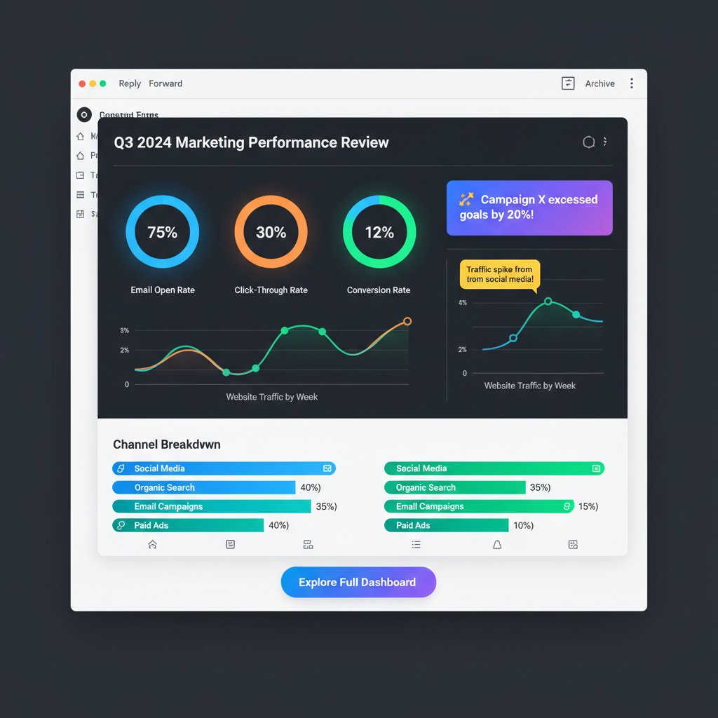
A typical report opens with a summary—one or two sentences that frame the key results. Next, it delivers core metrics, often with visual highlights for trends, anomalies, or targets. Embedded graphs and charts make patterns pop instantly, while personalized notes or calls to action ensure the recipient knows exactly what to do next. The best reports, according to research from Forbes Advisor, 2024, keep the layout clean, mobile-optimized, and interactive, catering to the 40-60% of users who read analytics on their phones.
Customization: One size never fits all
“Set it and forget it” is the fastest way to lose your audience. Customization is king—frequency, content, and audience segmentation determine whether your reports get read or relegated to the spam folder. Smart delivery systems allow users to select which metrics matter, how often they want updates, and even the format (visual vs. tabular) that best fits their workflow.
- Granular scheduling: Choose daily, weekly, or real-time reports based on urgency and team habits. Flexibility in timing prevents data blindness.
- Metric selection: Not all teams care about the same KPIs. Personalization means you can track what truly drives your business.
- Audience targeting: Segment reports for execs, managers, or hands-on teams. Contextual relevance boosts engagement.
- Branding and formatting: Tailor visuals and tone to your company’s voice for higher trust and recall.
- Interactive elements: Clickable charts or embedded links drive action, not just passive reading.
- Device optimization: Ensures reports look sharp on mobile, tablet, or desktop—vital for today’s workforce.
- Feedback loops: Built-in requests for user input improve subsequent reports and keep content relevant.
Take the healthcare sector: compliance dashboards differ from patient outreach analytics, so reports must adapt. In marketing, A/B test results, campaign performance, and ROI all matter—but to different people, at different times. The power of customization lies in letting each recipient get exactly what they need, nothing more, nothing less.
Visual storytelling in the inbox
Data is only as valuable as its clarity. Visualization—charts, graphs, and infographics—turns numbers into narratives. According to Litmus State of Email Reports, emails with effective visuals see a 21% higher click-through rate compared to text-only messages. Visual cues highlight trends, anomalies, and urgent issues in ways that traditional tables simply can’t.

But caution: overcomplicated graphics or tiny charts that break on mobile devices are classic mistakes. The best visualizations are clean, color-coded for clarity, and optimized to render well across all devices. Tips for clarity? Stick to 2-3 chart types per report, use explanatory captions, and always highlight what matters most—don’t just show data, show its significance.
Debunking myths: The truths behind email analytics
Myth #1: Email reports are always insecure
It’s a persistent myth that email reports are fundamentally less secure than in-app or dashboard analytics. In reality, the security of email-based analytics hinges on the implementation. End-to-end encryption, phishing-resistant delivery methods, and compliance-ready practices have made email a viable (and sometimes superior) channel for secure data.
Encrypts data from sender to recipient, preventing interception during transit—a must for sensitive analytics.
Combines authentication protocols (DMARC, SPF, DKIM) with behavior analytics to detect and block spoofed messages.
Follows regulations (GDPR, HIPAA, etc.) to ensure data privacy, consent, and secure handling at every step.
Insecure implementations, like sending reports over unencrypted channels or failing to authenticate recipients, are the real culprits. Case studies abound where businesses suffered breaches not because of email per se, but because of lax configurations. Conversely, leading organizations now routinely use secure, audited email channels for mission-critical reporting—with zero incidents when best practices are followed.
Myth #2: Nobody reads analytics emails
Let’s set the record straight with hard numbers. According to the 2024 GetResponse Benchmarks Report, the average open rate for analytics-related emails soared to 39.64%—a massive leap from previous years. Click-through rates are also up, as much as 3.2% on average, compared to 1.1% for general dashboards. Engagement varies by industry, but the trend is up and to the right.
| Industry | Open Rate (%) | Click-Through Rate (%) | Source |
|---|---|---|---|
| Finance | 43.2 | 3.7 | GetResponse, 2024 |
| Marketing | 38.5 | 3.3 | GetResponse, 2024 |
| Healthcare | 41.1 | 2.9 | Litmus, 2024 |
| Technology | 33.9 | 2.5 | Litmus, 2024 |
Table 2: Industry open and click rates for analytics emails (2024).
Source: Original analysis based on GetResponse 2024 and Litmus 2024 reports.
The difference between a neglected and an impactful analytics report isn’t the channel—it’s the design. Reports that are concise, visually engaging, and personalized see far better engagement than generic, unwieldy data dumps. If your analytics emails aren’t being read, the culprit is poor content, not the medium itself.
Myth #3: Email analytics are obsolete in the age of AI
Chatbots, dashboards, and data apps haven’t killed the email report—they’ve made it smarter. AI-powered platforms like teammember.ai use machine learning to personalize, contextualize, and even predict which insights matter most to the recipient. Rather than obsolete, email reports have become the frontline for actionable intelligence.
"AI doesn’t kill the email report. It makes it smarter." — Jess, data scientist
AI now enables anomaly detection, automated recommendations, and even plain-language executive summaries embedded directly in the email. Far from being a relic, email-based analytics reporting is evolving faster than ever—integrating the best of AI, automation, and human-centric design.
Inside the machine: How email analytics reports are built
The workflow: From raw data to inbox delivery
Peeling back the curtain, here’s what actually happens when you “automate” an email analytics report:
- Data extraction: Raw data pulled from databases, APIs, or spreadsheets—think sales numbers, web analytics, or operational KPIs.
- Data transformation: Cleaning, normalizing, and structuring the data for reporting. Errors and outliers handled here.
- Metric calculation: KPIs, trends, and targets are computed using predefined formulas or AI models.
- Visualization: Charts and graphs are generated, optimized for both desktop and mobile rendering.
- Report assembly: All components—summary, visuals, recommendations—are packaged in a branded, mobile-friendly email template.
- Scheduling: Reports are queued for delivery based on frequency and recipient preferences.
- Security and compliance checks: Encryption, authentication, and privacy protocols are applied to ensure safe delivery.
- Delivery and tracking: Emails are sent, with tracking pixels or analytics monitoring opens, clicks, and engagement.
The automation pipeline relies on robust error-handling: failed data pulls, formatting glitches, or delivery hiccups are logged and retried. Monitoring tools flag anomalies so nothing slips through the cracks. This is where the difference between a bulletproof system and a ticking time bomb becomes clear.
Integration headaches—and how to solve them
Integration isn’t a one-and-done affair. Connecting legacy databases, cloud platforms, and email automation tools can spark headaches—mismatched data formats, authentication woes, and API limits abound. According to a 2024 Litmus report, 67% of companies cite integration as their top challenge in launching automated analytics emails.
Alternative approaches abound. API-driven setups offer flexibility but demand strong IT resources. Plug-ins and third-party connectors simplify integration, but may limit customization. In practice, most organizations adopt a hybrid approach—combining secure connectors for standard data sources with custom API calls for specialized needs.
"Integration is never 'set and forget.' It’s an ongoing negotiation with your tech stack." — Priya, business owner
Solving integration means building in redundancy: fallback mechanisms for failed data pulls, sandbox environments for testing, and regular audits to catch silent errors. Documentation and user feedback close the loop, ensuring even non-technical users can understand and act on what shows up in their inbox.
Security, compliance, and privacy under the hood
The regulatory landscape for email analytics is a minefield—GDPR, HIPAA, SOC 2, and more. Each sets requirements for how user data is collected, processed, and delivered. For industries handling sensitive information (healthcare, finance, education), compliance isn’t optional. Every email report must be auditable, secure, and privacy-respecting at every hop.

Best practices include encrypting data in transit and at rest, using secure authentication (multi-factor, if possible), and tracking access logs to monitor for unauthorized views. Regular compliance audits and privacy impact assessments help organizations stay ahead of evolving regulations. Avoiding “shadow IT”—unsanctioned reporting tools—is crucial for preventing leaks and staying compliant.
The human factor: How people use (and abuse) email reports
Inbox psychology: Trust, habit, and blind spots
Psychological studies suggest that users are more likely to trust information delivered via email, especially if it comes from a familiar sender or follows expected formatting. This “inbox trust effect” can be a double-edged sword—trusted reports get acted upon, but they’re also prime targets for phishing.
On the flip side, too much information—or repeated, low-value reports—can trigger information overload and confirmation bias. Recipients may ignore or, worse, misinterpret analytics if the data isn’t presented clearly or arrives too often.

Designing email-based analytics reports with user psychology in mind isn’t just a “nice to have”—it’s a critical security and effectiveness measure.
Inbox zero vs. data paralysis
“Inbox zero” is the productivity gospel of the 2020s, but analytics emails throw a wrench into this dogma. Too many reports and alerts can stall decision-making, lead to data paralysis, or push key insights to the bottom of the pile.
- No clear subject lines: Vague or generic subjects guarantee your report gets ignored.
- Overly frequent updates: Too many emails make recipients tune out or set up filters.
- Unclear action items: If your report doesn’t highlight next steps, it’s just noise.
- Heavy attachments: Large files trigger spam filters and frustrate mobile users.
- Poor mobile formatting: Broken layouts kill engagement for the 40-60% of users reading on phones.
- Lack of relevance: Sending the same metrics to everyone dilutes value.
- No tracking or feedback: Without knowing what’s read or ignored, you can’t improve.
User anecdotes abound: one marketing exec slashed report frequency and saw engagement double; another overloaded team saw key losses because critical insights went unnoticed in the deluge. The trick is ruthless focus and relentless refinement.
Misinterpretation and the dangers of outdated data
The graveyard of analytics is littered with cautionary tales—where outdated or misread email reports led to costly business missteps. Consider the company that acted on last month’s sales numbers due to a scheduling error, or the HR department that missed a compliance deadline because an out-of-date metric stuck around.
- Outdated sales report triggers wrong inventory order: Led to $200K in overstock.
- Delayed compliance update causes regulatory fine: Cost the company $50K.
- Marketing campaign based on stale engagement data: Resulted in lackluster ROI.
- Executive acts on misconfigured KPI, missing critical risk signal: Set back project timeline.
- Automated report glitch sends incorrect financials to board: Damaged leadership trust.
Strategies to prevent such disasters include automated “freshness” checks, visible date/time stamps on every report, and built-in alerts if key data is missing or stale. Human oversight—a quick glance to confirm numbers—remains invaluable, even in the age of automation.
AI and the future of email-based analytics
How AI is rewriting the rules
A new era of email-based analytics is unfolding, powered by AI and machine learning. Modern systems don’t just deliver data—they sift through millions of rows to surface anomalies, forecast trends, and translate findings into plain English explanations.
Predictive alerts flag risks before they snowball. Machine learning personalizes which metrics show up in your report, learning from your clicks and past actions. For example, teammember.ai leverages advanced language models to craft recommendations tailored to individual users, ensuring that every email lands with context, not just content.

The leap isn’t just technical—it’s cultural. Teams now expect proactive insights, not reactive summaries. AI turns every inbox into an intelligence amplifier, cutting through bias and surfacing what truly matters.
Case study: AI-powered email analytics in action
Consider Acme Corp, a mid-sized retailer struggling with lagging sales. After integrating AI-driven email analytics, their sales managers received targeted daily reports highlighting not just raw numbers, but predicted hotspots for improvement. Within three months, sales rose 18%—spurred by quick, informed action on AI-flagged trends.
In HR, a tech company used AI-generated compliance reports to automatically flag missing certifications, slashing regulatory risk. In manufacturing, predictive maintenance alerts sent via email helped teams act before costly breakdowns, saving thousands in downtime. Nonprofits have leveraged tailored donor analytics reports to double engagement rates—all through inbox delivery.
Platforms like teammember.ai are at the vanguard, making AI-powered email analytics a reality for teams that don’t have a battalion of data scientists. The impact? Smarter, faster decisions—no dashboard logins required.
Risks and ethical dilemmas in automated insights
But with great automation comes great responsibility. Over-reliance on AI can introduce bias, propagate false positives, or obscure underlying data quality issues. Blind trust in automated reports has led companies astray—sometimes with millions at stake.
| Feature | AI-powered Email Analytics | Manual Email Analytics |
|---|---|---|
| Speed | Real-time | Delayed |
| Personalization | High | Low |
| Error Risk | Data/model bias | Human error |
| Scalability | Massive | Limited |
| Oversight | Needs auditing | Inherent in workflow |
Table 3: Pros and cons of AI-powered vs. manual email analytics (practical implications). Source: Original analysis based on 2024 industry reports.
The best practice? Combine AI’s speed and pattern recognition with human oversight and periodic audits. Set up feedback loops, monitor for bias, and make it easy to escalate questionable insights to real experts.
Implementing email-based analytics reports: A practical guide
Getting started: Your first bulletproof report
Launching your first automated email analytics report doesn’t require an army of engineers, but it does demand a disciplined approach. Here’s how to bulletproof your process:
- Define business objectives: Know what questions you need the report to answer.
- Identify data sources: Map out where your data lives—databases, SaaS apps, spreadsheets.
- Audit data quality: Clean, validate, and de-duplicate data before automation.
- Select reporting tools: Choose platforms with strong security, customization, and mobile support.
- Design report structure: Build a template with summary, KPIs, visuals, and clear calls to action.
- Set up scheduling and delivery: Match frequency to business needs—daily, weekly, real-time.
- Implement security and compliance: Encrypt, authenticate, and audit access to sensitive reports.
- Test everything: Run manual and automated tests to catch edge cases and formatting issues.
- Get feedback: Incorporate end-user input to refine content and delivery.
- Monitor and iterate: Track open rates, CTRs, and actionability—improve over time.
Common mistakes to avoid? Rushing deployment without data audits, skimping on mobile formatting, or failing to test across email clients. Each misstep risks losing trust, engagement, or regulatory standing.
Customization and scalability tips
Scaling from a handful of reports to thousands requires both technical muscle and design savvy. Templates and dynamic content blocks enable rapid customization for different teams or departments. User preference dashboards let recipients select metrics, timing, and formatting—keeping emails relevant as your organization grows.
Performance and deliverability hinge on technical best practices: use lightweight images, minimize attachments, and monitor bounce rates. As volume increases, stagger delivery times and track server feedback to avoid spam traps. Advanced users can set up reporting APIs, integrating analytics emails with in-app notifications or SMS for multi-channel delivery.
Measuring success: KPIs and continuous improvement
What KPIs matter for email-based analytics reports? Open rate, click-through rate, and action rate (measured as post-report decisions or follow-ups) are king. Bounce rate, unsubscribe rate, and deliverability are red flags for underlying issues. Continuous A/B testing—tweaking subject lines, formatting, and timing—drives incremental gains.
| Report Type | Open Rate (%) | Click-Through Rate (%) | Action Rate (%) |
|---|---|---|---|
| Executive Summary | 44.1 | 4.2 | 3.1 |
| KPI Deep Dive | 38.6 | 3.0 | 2.6 |
| Compliance Alert | 41.8 | 2.4 | 1.9 |
Table 4: Performance benchmarks for email-based analytics reports (2024).
Source: Original analysis based on GetResponse 2024 and Litmus 2024 reports.
Iterate relentlessly—what works today may lag tomorrow. Build feedback loops, analyze drop-offs, and update content to reflect evolving business priorities.
Beyond the hype: Comparing email reports to other analytics channels
Email vs. dashboards vs. chatbots
Each analytics delivery channel comes with strengths and weaknesses. Email is persistent, easily shared, and fits existing workflows—but can clutter inboxes. Dashboards provide depth and interactivity but suffer from login fatigue and overcomplication. Chatbots offer conversational, on-demand data, but context can get lost and insights may be limited.
| Feature | Email Reports | Dashboards | Chatbots |
|---|---|---|---|
| Accessibility | Ubiquitous | Requires login | In-app, limited |
| Actionability | High | Variable | Contextual |
| Engagement Rate | High | Low-Medium | Medium |
| Customization | High | Very High | Moderate |
| Overload Risk | Moderate | High | Low |
Table 5: Comparison of email-based, dashboard, and chatbot analytics delivery channels (2024).
Source: Original analysis based on industry reports.
The smart play? Use each channel where it excels. Deploy email reports for recurring, high-level insights; dashboards for deep dives; chatbots for real-time queries.
Hybrid approaches: Best of both worlds?
Forward-thinking organizations now blend email-based reports with dashboards, in-app alerts, and SMS for layered, multi-channel insights. For instance, a weekly email might summarize KPIs, while daily anomalies trigger instant SMS or in-app notifications. In marketing, hybrid strategies have been shown to double campaign engagement.

Case studies from finance, healthcare, and retail all highlight the same conclusion: hybrid delivery, when orchestrated well, maximizes both reach and relevance.
The future: Will email-based analytics survive?
Speculation aside, the present reality is clear: email is far from dead. According to Amir, IT manager, “Email isn’t dead. It just keeps reinventing itself.” This reinvention—powered by AI, automation, and user-centric design—ensures that email-based analytics reports remain at the heart of business intelligence.
Organizations future-proof their analytics delivery by building flexible, channel-agnostic systems that can plug into new platforms as needed. The lesson? Don’t bet against your inbox just yet.
Glossary and jargon-buster
Key terms you need to know
A report automatically generated and delivered via email at regular intervals. Keeps teams aligned without manual intervention.
The art of using narrative techniques and visuals to turn raw data into actionable insights. Ensures reports aren't just read, but understood.
A piece of analysis that prompts a clear decision or action. The core value of any analytics report.
The likelihood that an email report actually lands in the recipient’s inbox (not spam). Essential for reliable communication.
The percentage of sent emails that are returned as undeliverable. High bounce rates indicate technical or data hygiene problems.
Email elements that change based on recipient, time, or data context. Enables personalization at scale.
Reports designed to meet regulatory standards (GDPR, HIPAA, etc.) for data security and privacy.
Information directly shared by users with organizations, used to personalize reports without relying on third-party cookies.
Report delivery methods that use authentication and monitoring to prevent spoofing and cyber attacks.
AI-driven process of identifying unusual patterns or outliers in data, often triggering alerts in email reports.
Understanding these concepts is non-negotiable for anyone building, deploying, or relying on email-based analytics reports today. They’re the backbone of secure, effective, and user-centric reporting.
Final thoughts: What your inbox isn’t telling you (yet)
Email-based analytics reports aren’t just a digital convenience—they’re the front line in the battle for business intelligence. From their roots in static spreadsheets to the AI-powered reports of today, they’ve evolved into a tool that empowers, informs, and occasionally overwhelms. The real story lies in the interplay of technology, psychology, and process: how you design, secure, and act on what lands in your inbox.

In a world where every decision counts, inbox empowerment is no longer optional. The next time you scan an email analytics report, remember: behind each chart is a web of systems, choices, and risks. Mastering email-based analytics means mastering your own data destiny—one report at a time. Are you reading what your inbox is really telling you, or just skimming the surface? The answer could be the difference between leading the pack and missing your next breakthrough.
Sources
References cited in this article
- GetResponse Benchmarks Report(getresponse.com)
- Forbes Advisor: Email Marketing Statistics(forbes.com)
- Litmus State of Email Reports(litmus.com)
- VIPRE: Email Security in 2024(theimagingchannel.com)
- Smart Insights: Email Trends 2024(smartinsights.com)
- Main Event Digital: 2024 B2B Best Practices(maineventdigital.com)
- Neil Patel: Email Best Practices 2024(neilpatel.com)
- StudioID: Email Campaign Strategies(studioid.com)
- RichClicks: Email Strategy Trends 2023-2024(richclicks.co.uk)
- GetResponse: Email Marketing Statistics(getresponse.com)
- Mailtrap: Email Design Trends(mailtrap.io)
- Stripo: Email Content Trends 2024(stripo.email)
- Litmus: Top Email Design Trends(litmus.com)
- VBOUT: Email Marketing Myths 2024(vbout.com)
- Radicati: Email Statistics Report 2023-2027(radicati.com)
- Trew Marketing: Podcast with Jeanne Jennings(trewmarketing.com)
Be First to Try Your AI Team Member
Every week without automation is dozens of hours lost to operational work. Hours you'll never get back. Join the waitlist and get priority access.
Frequently Asked Questions
What is email-based analytics reporting and how does it differ from traditional dashboards?
Email-based analytics reporting delivers data insights directly to your inbox on a schedule, eliminating the need to log into platforms or navigate multiple dashboards. Unlike traditional dashboards that require active engagement, email reports push information to users, reducing the friction of platform logins and helping busy professionals access data without chasing it across multiple tools.
Why have email analytics reports become more popular than dashboards?
Email analytics reports have surged in popularity due to 'dashboard fatigue'—the challenge of engaging with data across oversaturated apps and endless notifications. According to a 2024 GetResponse Benchmarks Report, email open rates for analytics and business reports have jumped sharply because busy professionals prefer having data delivered to them rather than logging into platforms to find it.
Which industries are adopting email-based analytics reporting?
Email-based analytics reporting has become a staple across industries including finance, marketing, and healthcare, driven by the need for real-time insights without the friction of platform logins.
What are some potential risks or concerns mentioned about email-based analytics reports?
The article references concerns including data breaches, the reliability of 'inbox trust,' and hidden pitfalls behind cleanly formatted charts that may not tell the complete story.
From the Archive
Explore more from AI Team Member

Why Email-Based Reporting Tools Are Disrupting Business As Usual
Discover the untold benefits, real-world cases, and hidden risks of modern email automation. Upgrade your workflow today.

Is Your Inbox Smarter Than You? the AI Reporting Revolution
Discover how AI-powered email assistants are transforming reporting, boosting productivity, and reshaping workflows in 2026.

AI Data Analysts in Your Inbox? Here’s the Disruptive Truth
Discover how AI-powered email analysts are revolutionizing data workflows, exposing hidden risks, and delivering actionable insights in 2026.

Email-Based Market Insights: the End of Dashboards?
Discover insights about email-based market insights

Email-Based Market Analysis: Your Unfair Advantage in Plain Sight
Discover insights about email-based market analysis

Unlock the Secret Power of Email-Based Data Analysis
Email-based data analysis reveals powerful insights you’re missing. Unlock hidden value, avoid costly mistakes, and master your inbox with expert strategies.

Are Email-Based Progress Reports a Productivity Hack or a Burnout Trap?
Email-based progress reports are disrupting workflows in 2026. Discover hard truths, hidden pitfalls, and bold wins—plus a guide to real, actionable reporting mastery.

Email Report Generation Tools in 2026: Automation Without Chaos
Discover insights about email report generation tool

Is Your Inbox Smarter Than You? the Truth About AI Email Analysts
Discover how AI transforms your workflow, uncovers hidden insights, and boosts productivity in 2026. Don’t get left behind—explore the future now.

Are You Ready to Trust AI with Your Biggest Decisions?
Email-based decision recommendations are redefining how teams work. Discover bold truths, hidden risks, and expert insights to upgrade your workflow today.

9 Ruthless Truths About Email-Based Professional Writing
Email-based professional writing redefined: Discover brutal truths, hidden hacks, and expert strategies to master influence in every inbox. Read now or get left behind.

The Brutal Truth About Automatic Report Delivery Via Email
Automatic report delivery via email just got smarter. Discover the untold realities, hidden pitfalls, and breakthrough strategies for 2026. Stop missing out—read now.


